SUNY Geneseo, Department of Computer Science
by Doug Baldwin
Images, whether still (e.g., photographs, drawings) or moving (e.g., video) are widely viewed and stored on computers. This document provides an introduction to how computers represent images. The document emphasizes still images, but ends with a brief discussion of how ideas developed for still images extend to video.
Although this document is intended to be self-contained, as are most discussions of digital image representation, it is worth keeping in mind that image representation is really a form of signal processing. As such, there are deep connections between the ideas presented below and other types of signal processing, for example digital representation and manipulation of sound.
A digital image consists of a large number of small spots of color. These spots are called pixels, a contraction of “picture elements.” When displayed on a monitor or printed on paper, pixels are so small and so closely packed together that the collective effect on the human eye is a continuous pattern of colors. However, if you look closely at magnified computer displays, for example as produced by projectors, you can sometimes see individual pixels as small rectangles.
Figure 1 shows the pixels that make up part of a digital photograph of a cat. The original photo is on the left side of the figure, while a magnified section of the cat’s face is on the right. Each small colored square in the magnified section is a single pixel; pixels are particularly evident in the magnified eyes and whisker.
![]()
Fig. 1. A digital photo (left), with a magnified section showing pixels (right).
Computers represent the color of a pixel using a trick long known to artists: mixing primary colors (recall that any color can be described as a mixture of suitable amounts of three primary colors). Two sets of primary colors are relevant to computers. Monitors and similar devices display pixels by emitting light in various colors; light of each color adds to the light of the other colors to produce a single color seen by your eye. This is an additive way of generating color, because it adds various amounts of colored light together. The most popular additive primary colors are red, green, and blue. On the other hand, printers display pixels by placing colored ink on paper; these inks absorb certain colors of incident light (light hitting the paper from somewhere else, such as from light bulbs or the sun), leaving other colors to be reflected and seen by your eye. This is a subtractive way of generating color—it removes certain colors from white light. The best primary colors for subtractive systems are cyan, magenta, and yellow. Printers often supplement these primary colors with black, because black is heavily used in printing (e.g., for text), and because while equal amounts of cyan, magenta, and yellow ink theoretically produce black, the inks actually available today combine to form dark brown.
The color of a pixel in a digital image is therefore specified by stating the amount or intensity of each primary color present in the pixel. The intensity of each primary color is given as a number, ranging from 0 to some maximum possible intensity. Most digital images define the maximum intensity of each primary color to be 255, meaning that the intensity of each primary color in a pixel can be described in 8 bits or one byte (there are 256 numbers between 0 and 255, counting both 0 and 255; it takes log2256, or 8, bits to represent 256 distinct values).
People often say that color pixels have three components, refering to the three things needed to describe a color. The components of digital colors are almost always the red, green, and blue (or “RGB” for short) primary colors. Because these colors are additive primaries, lower numeric values for one or more of a pixel’s components darken that pixel’s color. Since this document is about digital images, it will follow these conventions except where stated otherwise.
As an example of pixel representation, here are the pixels that form the top left corner of the photograph in Figure 1. Each row in this table describes the first four pixels in one of the top four rows of pixels in the photo; the table describes each pixel as its red, green, and blue components, in that order.
| 70, 48, 36 | 70, 49, 38 | 71, 52, 42 | 71, 52, 44 |
| 64, 38, 30 | 71, 45, 39 | 80, 58, 52 | 81, 61, 53 |
| 58, 29, 23 | 67, 37, 34 | 85, 58, 53 | 90, 67, 57 |
| 53, 34, 22 | 60, 38, 29 | 78, 55, 45 | 84, 67, 52 |
While the table describes a part of the photo barely a big enough to see with the naked eye, you can at least tell that it is a generally dark region. That fact is reflected in the relatively low (on the usual 0 to 255 scale) intensity values in the table. On the other hand, one of the yellowish pixels from the cat’s eyes has intensity values 201, 159, and 67. The relatively high red and green intensities produce the generally yellow color—equal amounts of red and green with no blue would produce pure yellow, but the actual color in the eye is a yellow-brown. Finally, the bright highlight in the center of the cat’s eye has intensities 251, 255, and 250, representing a color near white (pure white would be produced by setting the intensities of all three primary colors to 255).
Note that how numbers specify color intensities is mostly a matter of arbitrary convention. There are at least two reasons for this arbitrariness. First, there are few inherent properties of color to constrain its digital representation. Using one byte per primary color per pixel works well with current computer hardware, in which one byte is typically the smallest piece of data that can be processed. However, applications that need very precise control over colors or very large ranges of intensities sometimes use 16 bits per primary color instead of 8. In other applications it is convenient to think of color intensities as real numbers between 0 (no color present) and 1 (color present in its maximum intensity) instead of as integers. None of these representations is universally better than the others, and all convey essentially the same information (how bright a color is); it is easy to convert between representations if necessary.
The second reason that the intepretation of numbers as color intensities is arbitrary is that different display devices reproduce color differently. Because of manufacturing differences, different displays use slightly different shades of red, green, and blue as their primary colors, or have slightly different ranges of intensities they can generate. Therefore, the same red, green, and blue numeric intensities will invariably produce slightly different colors on different displays. Although standard color systems do exist, as a practical matter the fact that different displays reproduce the “same” color differently is a problem that people concerned with digital color simply have to live with.
Not all images use color. Some, whether for artistic effect or because of age or for other reasons, are black and white (or, more accurately, grayscale, because they contain shades of gray as well as black and white). Describing a pixel in a grayscale image only requires one component, describing the pixel’s lightness or darkness. Numerically, a 0 to 255 scale is common, so that each pixel can be represented in one byte. Low numbers represent dark shades (0 is pure black) and high numbers represent light shades (255 is pure white). Most image file formats have an option for storing grayscale images in this one-component-per-pixel format instead of the full three components per pixel needed for color.
Digital images contain a lot of bits. Not so long ago, this fact meant that it could be hard to store many images on a typical computer. Computer storage is less of a concern today, but image size still matters for such things as how many photos a camera can hold or how long it takes to send a picture to or from a mobile phone.
Because a digital image is an array of pixels, three things determine its size:
Total image size, in bits, is simply the product of these three quantities:
S = w × h × d
where S is the image size in bits, w is its width in pixels, h is its height in pixels, and d is its depth in bits.
For example, consider a digital photograph that is 1748 pixels wide by 1240 pixels high (this is fairly small for a photograph), and uses 8 bits for each of the red, green, and blue primary colors in each pixel. This photo’s pixel depth is the total number of bits in one pixel, or 8 + 8 + 8, i.e., 24. The total number of bits in the photo is then 1748 × 1240 × 24 = 52,020,480 bits. Since one byte is 8 bits, dividing by 8 gives the size in bytes, a more conventional unit of the size of digital documents: 52,020,480 ÷ 8 = 6,502,560, or about 6 megabytes.
Understanding how images are represented as arrays of pixels, and pixels are represented as triplets of color intensities, makes it easy to design image processing algorithms. For example, consider converting color images to grayscale, perhaps in order to make a modern color photograph look like it was taken in the days of black and white photography. The basic task in converting from color to grayscale is to assign each pixel in the grayscale image a brightness that captures the net brightness of the primary colors in the corresponding pixel in the color image. The average of the red, green, and blue intensities is a simple but effective measure of the “net brightness” of a color pixel, leading to the following algorithm:
    Input: a color image, C

    Algorithm:
        let G be a grayscale image (i.e., an array of 1-component pixels) of the same width and height as C
        for each pixel, p, in C, do the following:
            set brightness = (p’s red intensity + p’s green intensity + p’s blue intensity) / 3
            set the intensity of the corresponding pixel of G to brightness

    Output: G, a grayscale version of C
Figure 2 shows a grayscale image produced by this algorithm, alongside its original color image.
![[Yellow Bird beside Gray Bird]](img/grayscale.png)
Fig. 2. A full-color picture (left) and an algorithmically generated grayscale version (right).
Physically, an image originates as a continuous distribution of color intensities over the surface of a film, retina, or other sensor. Figure 3 illustrates this, by plotting light intensity across a picture of a flower bed. The graph shows the intensity of green light in the flower image as you scan from left to right between the red pointers. Intensity is measured on a 0-to-255-unit scale, and position as the fraction of the distance from the left side of the picture to the right side. Although the graph is very jagged, it is continuous: there are no breaks in the plotted line, and you could pick any point across the picture and read the green intensity at that point from the graph.
![[Flowers and Green Intensity Varying Jaggedly Along One Horizontal Line through Them]](img/greenscan.png)
Fig. 3. Variation in light intensity over space. The graph shows the green light intensity from left to right along the line between the red pointers in the flower image.
In digital form, a continuous physical image has to be divided into discrete pixels, and the physically infinite gradations of intensity have to be approximated by a finite set of values representable in a pixel. Thus capturing, storing, and displaying digital images is a kind of signal processing, much like the digital manipulation of other continuous physical phenomena such as sound. The issues that affect how accurately any digitized signal reflects its original therefore also affect digital images, in particular…
(Interestingly, Scott Russell of Highpoint University has pointed out to me that there may not actually be anything capable of perceiving images as continuous color distributions: animal retinas are made up of discrete cells, photographic films contain discrete grains of light-sensitive chemicals, and digital cameras contain discrete light sensors. So maybe these issues in sampling a continuous color distribution actually apply to all image perception, not just to digital images.)
Because a digital image must be some finite number of pixels wide and high, every digital image treats light intensities as constant over small intervals of space. Figure 4 demonstrates this idea. The black curve in the figure is a magnified (and slightly hypothetical) version of the left-hand end of the light intensity curve from Figure 3. The red lines show what would happen if this part of the image were divided into pixels in such a manner that the full image was 100 pixels across (i.e., each pixel covered 1% of the image’s width): The first 1% of the image would lie in a single pixel, and so despite the fact that the physical light intensity varies across that interval, it would be approximated by a single value for the pixel. Similarly the varying light intensity between the 1% and 2% points would be approximated by another value, and so forth. Thus, physically continuous light intensity curves in the “real world” become discontinuous plateaus in a digital image. The signal is discretized, i.e., broken into individual discrete samples—the plateaus. This effect creates the sharp boundaries between pixels you can sometimes see in magnified digital images.
![[Smooth Curve Approximate by Flat Segments]](img/ScanLineDetail.png)
Fig. 4. A physical light intensity curve (black) and its pixel-sampled version (red).
Because each pixel value is represented by some fixed number of bits, the “plateaus” in discretized intensity plots can only lie at certain heights. Figure 4 also illustrates this idea: the red axis on the right side of the graph represents intensity values in a hypothetical 3-bit code (i.e., a code in which intensities must be represented as one of the numbers 0, 1, 2, 3, 4, 5, 6, or 7). Each “plateau” must lie at one of these values, even if that value is not an ideal representation of actual light intensity (as in, for example, the middle pixel in Figure 4). This process of approximating color intensities (or any other signal) that can theoretically have any value with values picked from some finite set is called quantization. As mentioned, the values representable in a quantized signal generally differ from the values that best represent the original signal across any specific interval. This difference is called quantization error or quantization noise. Fortunately, modern image representations provide enough bit depth that quantization error doesn’t normally cause perceptible distortion in pictures.
The fact that digital images are divided into discrete pixels means that very small features in a physical image cannot be accurately captured in digital form. The concept of spatial frequency is helpful in understanding how small a feature is too small to capture accurately: just as sound or other time-varying signals vary cyclically over time, color intensities in an image vary cyclically over space (i.e., over the image’s width and height). The right-hand plot of color intensity in Figure 3 illustrates this cyclic variation. The rate at which color intensities cycle can be expressed as a frequency, expressed in cycles per pixel—distinguishable features in a digital image will have frequencies of much less than one cycle per pixel, i.e., each cycle will contain many pixels. Intuitively, spatial frequency is inversely related to a feature’s size: a large feature covers many pixels, and so has a number of cycles per pixel much less than one, while a small feature covers only a few pixels (or even less than one) and so has a spatial frequency closer to (or even greater than) one cycle per pixel.
A general theorem of signal processing, Nyquist’s Theorem, says that a signal must be sampled at least twice per cycle in order to be accurately reproduced from the samples. In the case of digital images, this means that light intensity variations faster than half a cycle per pixel cannot be be reproduced well (intuitively, a feature that doesn’t cover at least two pixels cannot have its brightest and darkest parts displayed as separate colors).
In some kinds of digital signal processing, for example digital sound, trying to record frequencies higher than the limit set by Nyquist’s Theorem produces striking shifts in frequency called “aliasing.” The consequences of overly high spatial frequencies in digital images are less startling however, mainly causing blurring or disappearance of high-frequency features.
Digital images do, however, exhibit a distortion related to sampling rate, as shown in Figure 5. This figure shows a slanted red line, and two magnifications of part of that line. The first magnification (in the middle of the figure) shows how the edges of the line are in fact jagged. Ideally, as the edge of the line passes through a pixel, part of that pixel is on the red side of the edge and part on the white side, as shown in the second magnification. However, a pixel has to be all one color, not partly red and partly white, so the smooth edge has to be approximated by a series of all-red or all-white pixels. Ultimately, the jaggedness is due to the inability of discrete pixels to sample the edge of the line perfectly. In image processing and computer graphics, this jaggedness is called “aliasing” (note that this is not quite the same meaning that “aliasing” has elsewhere in signal processing) or more colloquially, “jaggies.”
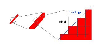
Fig. 5. “Jaggies” due to pixels not aligning exactly with the edge of a sloped line.
It’s not entirely true that the pixels in Fig. 5 have to be either red or white. Another way to reduce the visual effect of aliasing would be to make pixels along the line some shade of pink, according to what fraction of the pixel is on the red side of the line and what fraction is on the white side. This is in fact a common solution; you can see it in use in Fig. 1 if you look at the magnified cat’s whisker or eye: the whisker isn’t a single-color line, and the eye doesn’t have a sharp boundary; rather, both lines consist of regions in which pixels shade from the whisker or eye color to the surrounding background color. As also seen in this example, blending colors can reduce aliasing but isn’t a complete solution for it.
When digital image processing was first developed, high-quality image files were very large compared to the memory and disk space available on most computers. Today, with much larger memories and disks, the space that it takes to store an image is of less concern, but the time that it takes to transmit a large image across a network can still be a problem. Thus image compression, or storing images in fewer bits than required by a straightforward store-all-the-color-information-for-every-pixel approach (a so-called raw image), was and still is an important part of digital image representation.
Image compression is so important that a vast number of ways of doing it exist. The following is by no means an exhaustive description; it merely introduces some of the issues and a few illustrative and important compression schemes.
The standard measure of how much an image (or other data file) is compressed is the compression ratio, the ratio of the size of the raw image to the size of the compressed one. For example, if a raw image occupies 10 megabytes, and a compressed version of it occupies 1 megabyte, the compression ratio is 10:1. Higher compression ratios indicate more compression.
There are two general kinds of data compression. Lossless compression compresses data in such a way that every bit (literally) of information in the original file can be recovered from the compressed file. Lossy compression, on the other hand, compresses data in such a way that decompressing a compressed file does not produce exactly the same file as the original—information has been lost in compression. You would think that losing information through lossy compression would be unacceptable, and in some applications it is. For example, even one corrupted word in a written text is noticeable to a reader, and may completely change the meaning of the text. On the other hand, the human visual system (and other senses) is very good at extracting meaning from noisy images (it was probably useful to our ancestors to recognize “lion” even if the actual animal was partly hidden by grass and dappled by shadows). As a result, considerable information can be lost from most images without significantly, or even perceptibly, changing what a viewer sees. The advantage of lossy compression is that it can achieve much higher compression ratios than lossless schemes, and so most image compression systems are lossy.
The “Portable Network Graphics,” or PNG, image compression standard was, as its name suggests, developed for transmitting images across networks. Its main advantages, at least according to its proponents, are that it is free (its specification is widely published, and computer code for implementing is available for free to anyone who wants it), and lossless (although as suggested above this may not always be an advantage, as it limits the compression ratios PNG can achieve—but PNG certainly compresses well enough for its intended uses). It has become popular on the World Wide Web—most of the images in this document are in PNG format.
The central idea behind PNG compression is that sequences of pixel values often repeat in images. Later occurrences of a repeated sequence needn’t be stored in full, instead they can be replaced by a few numbers that say, in effect, where in the image to find an earlier occurrence and how long it is.
The “Graphics Interchange Format,” GIF, is a commercial precursor to PNG, and is also commonly used on the Internet. (Part of the motivation for developing PNG was to provide a free alternative to GIF). GIF compression is based on the realization that many images, particularly drawings or diagrams, use only a small number of colors, yet every pixel in a raw representation of the image uses three bytes to describe the red, green, and blue color intensities. If, instead of giving a complete description of a color independently in every pixel that uses that color, the complete description were written only once and stored in a table, and each pixel merely stored the position in the table of its color, considerable compression could be achieved. In actual use, GIF files use a 256-entry table, meaning that each pixel can be stored in only one byte. GIF thus achieves a compression ratio of essentially 3:1 (the table size is negligible compared to the size of realistic images). As long as the original image used fewer than 256 colors, GIF compression is lossless. However, for images with a wider palette of colors, such as colorful photographs, GIF compression becomes lossy, and can show noticeable distortion.
The “Joint Photographic Experts Group,” or JPEG, compression system was, as the name suggests, developed for compressing photographs. It is widely used in digital cameras to compress photos as they are taken, and is also widely used on the World Wide Web for distributing photos. JPEG is based on storing descriptions of the spatial frequencies present in an image instead of storing the individual colors of individual pixels. One of its distinctive features is that the algorithms that extract frequency information from raw pixels can be adjusted on-the-fly by users to control the trade-off between compression ratio and the quality of the decompressed images. If one is willing to accept distortion in decompressed images, JPEG can deliver very high compression ratios; conversely, if one is willing to accept a relatively low compression ratio, JPEG can deliver very high image quality.
Figure 6 compares several kinds of image compression. The center image is compressed with JPEG at its highest quality setting; it is essentially the original photograph to which the others are compared. The image on the left is the same photo compressed by GIF. If you look closely at that image, you can see “speckles” in it. They are the result of GIF not being able to represent all of the subtly different shades of color in the original. The image on the right is compressed with JPEG, like the middle image. However, the right-hand image is compressed for high compression and low quality—it only occupies about one quarter of the memory required by the original, but shows considerable distortion compared to the original.
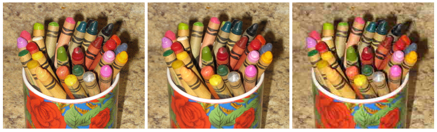
Fig. 6. Three examples of image compression. Left: GIF, Center: high-quality JPEG; Right: low-quality JPEG.
In principle, ways of storing and representing still images extend easily to representing moving pictures. The key insight is that the human visual system, when presented in rapid sequence with a series of still images (frames) of a moving scene, will reconstruct the motion from the still images. The crucial speed is around 25 to 30 images per second. Thus, from the invention of the motion picture until today, the essential idea behind video has remained the same: take a quick succession of still images, and play them back at the same rate at which they were taken (unless you want slow motion or accelerated motion, in which case you can play them back at a slower or faster rate, respectively).
If a single digital image occupies a large number of bits, a sequence of many digital images occupies an immensely larger number of bits. Compression for digital video is therefore even more important than it is for still digital images. Fortunately, the fact that images change relatively little from frame to frame in video presents great opportunities for compression, based on storing only the changes between frames instead of storing every frame as a complete still image.
For more information on primary colors and how they create other colors, the Wikipedia article on “primary color” is quite good. (Anonymous, “Primary Color,” http://en.wikipedia.org/wiki/Primary_color, retrieved July 17, 2012.)
A comprehensive but somewhat technical description of PNG image compression appears in Greg Roelofs’s book PNG: The Definitive Guide, available on the World Wide Web. (Greg Roelofs, PNG: The Definitive Guide, 2nd ed. (HTML version), 2002-03, available at http://www.libpng.org/pub/png/book/, retrieved October 21, 2012.)