

Brand Typography
Typography Definitions
Typeface vs. Font
A typeface refers to the entire font family within a specific text visual (e.g., Arial). A font refers to the particular weight and style of the typeface (e.g., Arial Bold, Arial Italic, Arial Regular, etc.).
Serif vs. Sans Serif
Serif refers to the decorative strokes attached to the end of a letter. The serif functions as a tool to help guide a reader’s eye along a line of text, which can help for better readability in longer sections of text. This style of typeface is more traditional, elegant, and formal. Common examples of serif typefaces include Times New Roman, Baskerville, and Georgia.
Sans serif refers to a style of typeface that does not include the decorative strokes a serif typeface does. This style is more clean, modern, and simple, which allows for better readability. Common examples of sans serif typefaces include Helvetica, Arial, and Calibri.
Official Brand Typefaces
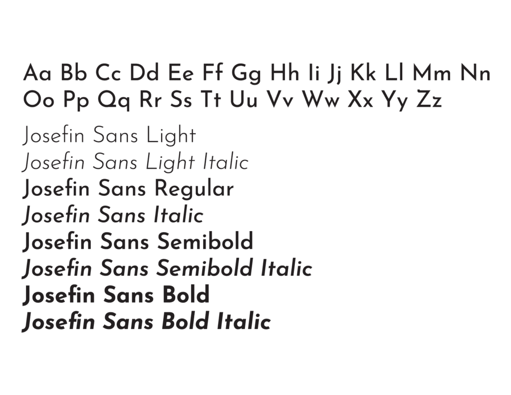
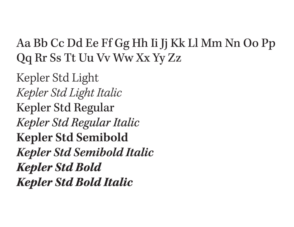
The official typefaces for the SUNY Geneseo brand are Josefin Sans and Kepler STD. The Josefin Sans font family is available for download on Google Fonts. Kepler STD is only accessible for use through Adobe Fonts for those with an Adobe Creative Cloud account. There are alternative typeface options if the official typefaces are unavailable for use.
Josefin Sans was designed by Santiago Orozco, inspired by 1920s geometric fonts. This typeface is the primary sans serif typeface to use for headers, subheads, and call-outs in all publications and digital media.
Kepler STD was designed by Adobe type designer Robert Slimbach. This typeface is the primary serif typeface to use for body copy in print materials.
Hierarchy of Typefaces
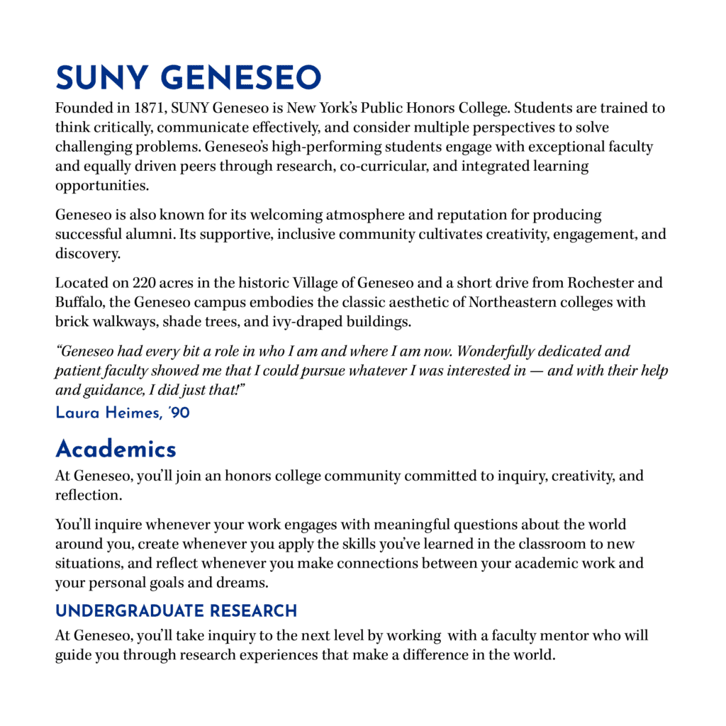
This example demonstrates how to apply typefaces. For print materials, Josefin Sans should be used for titles, headlines, and call-outs, while Kepler STD should be used for the body copy.
Alternative Typefaces
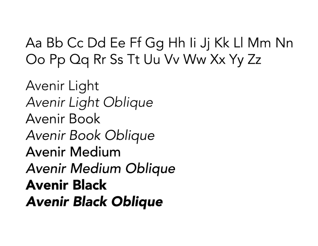
Alternative typefaces can be used as a substitute for the official brand typefaces.
Avenir was designed by Adrian Frutiger and is a geometric sans serif typeface. This font family can be used as a substitute for Josefin Sans if it is not available.
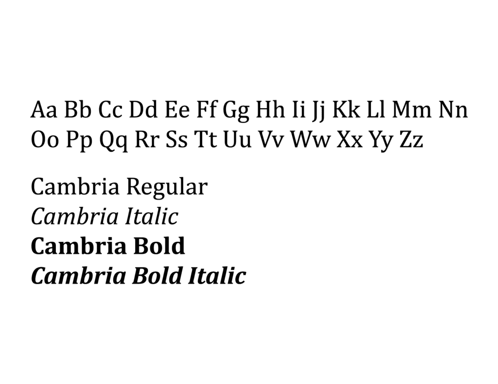
Cambria was designed by Jelle Bosma and is a serif font that was commissioned by Microsoft. This font family can be used as a substitute for Kepler STD.
Typeface Usage
Incorrect and Correct Usage of Typefaces
- Do not use Josefin Sans or a sans serif font in letterhead communications.
- Do use Cambria or Kepler STD (serif) for letterhead communications.
- Do not use Cambria or Kepler STD for PowerPoint presentations.
- Do use Josefin Sans or Avenir (sans serif) for PowerPoint presentations.
- Do not use any typefaces beyond the ones outlined in the brand guide.
- Do use the typefaces mentioned in the brand guides based on their stated uses.